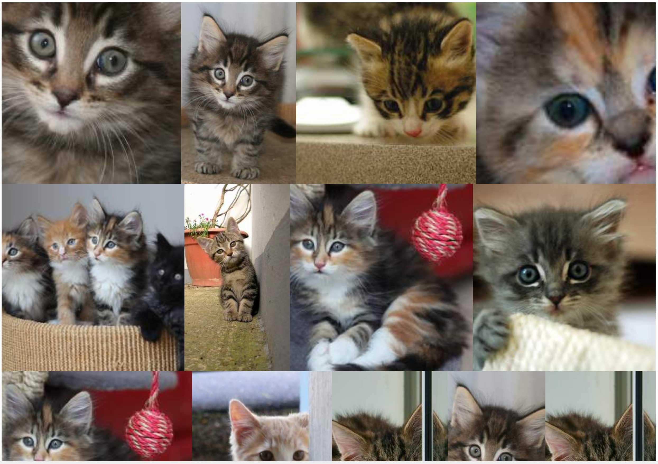
Affichage d'une galerie d'images de différentes tailles et proportions avec les spécifications suivantes:
- Pas de blancs (marges) entre les images.
- Respecter autant que possible le ratio d'origine.
- Images entourées d'un lien.
- Solution non JS.
- Les images pourraient être recadrées un peu.
- Solution portable.
- L'ensemble des images affichées est aléatoire.
- Les images doivent être affichées de gauche à droite (empêche l'utilisation de colonnes).
J'y suis parvenu avec la solution flexbox suivante:
section {
  display: flex;
  flex-flow: row wrap;
  justify-content: center;
}
section a {
  flex: auto;
}
section img {
  height: 100%;
  width: 100%;
  object-fit: cover;
}
<!DOCTYPE html>
<html lang="en">
<head>
    <title>Controlling flex growability</title>
    <meta name="viewport" content="width=device-width,initial-scale=1">
    <style>

    </style>
</head>
<body>
    <section>
        <a href="#"><img src="https://placekitten.com/400/195" width="400" height="195" alt="Kitty"></a>
        <a href="#"><img src="https://placekitten.com/256/400" width="256" height="400" alt="Kitty"></a>
        <a href="#"><img src="https://placekitten.com/400/237" width="400" height="237" alt="Kitty"></a>
        <a href="#"><img src="https://placekitten.com/400/111" width="400" height="111" alt="Kitty"></a>
        <a href="#"><img src="https://placekitten.com/400/245" width="400" height="245" alt="Kitty"></a>
        <a href="#"><img src="https://placekitten.com/400/227" width="400" height="227" alt="Kitty"></a>
        <a href="#"><img src="https://placekitten.com/250/400" width="250" height="400" alt="Kitty"></a>
        <a href="#"><img src="https://placekitten.com/400/269" width="400" height="269" alt="Kitty"></a>
        <a href="#"><img src="https://placekitten.com/400/255" width="400" height="255" alt="Kitty"></a>
        <a href="#"><img src="https://placekitten.com/288/400" width="288" height="400" alt="Kitty"></a>
        <a href="#"><img src="https://placekitten.com/234/400" width="234" height="400" alt="Kitty"></a>
        <a href="#"><img src="https://placekitten.com/194/400" width="194" height="400" alt="Kitty"></a>
        <a href="#"><img src="https://placekitten.com/222/400" width="222" height="400" alt="Kitty"></a>
        <a href="#"><img src="https://placekitten.com/400/227" width="400" height="227" alt="Kitty"></a>
        <a href="#"><img src="https://placekitten.com/192/400" width="192" height="400" alt="Kitty"></a>
        <a href="#"><img src="https://placekitten.com/400/141" width="400" height="141" alt="Kitty"></a>
        <a href="#"><img src="https://placekitten.com/400/289" width="400" height="289" alt="Kitty"></a>
        <a href="#"><img src="https://placekitten.com/400/255" width="400" height="255" alt="Kitty"></a>
        <a href="#"><img src="https://placekitten.com/210/400" width="210" height="400" alt="Kitty"></a>
        <a href="#"><img src="https://placekitten.com/400/187" width="400" height="187" alt="Kitty"></a>
    </section>
</body>
</html>
La solution fonctionne, mais en fonction de la taille de la fenêtre, certaines images sont trop agrandies, je préférerais plus d'éléments par ligne, même si les éléments doivent être plus rétrécis.
Cela signifie qu'au lieu de:
Je préférerais une densité d'éléments plus élevée pour que les images ne soient jamais agrandies:
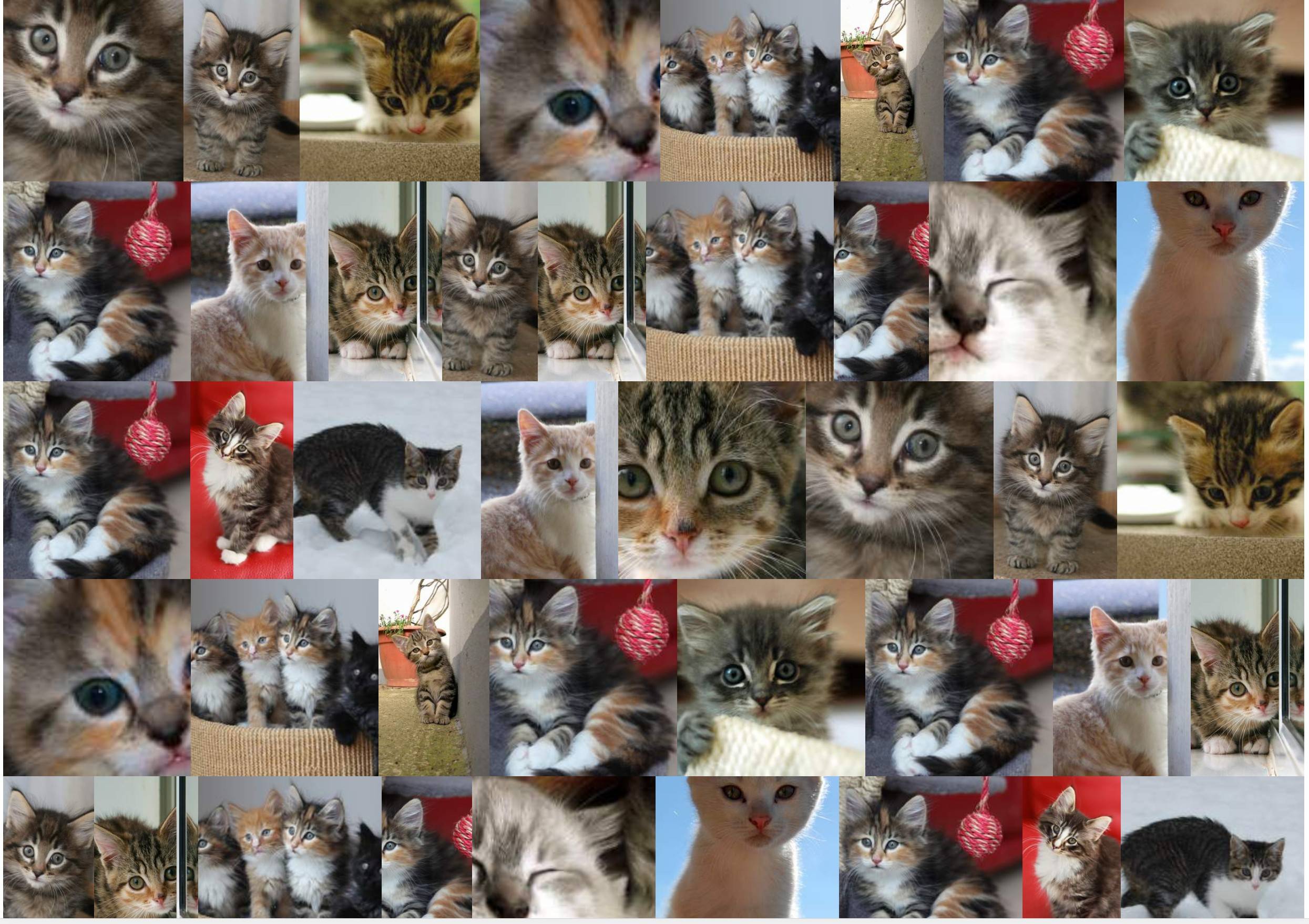
J'ai cherché des solutions pour augmenter globalement le nombre d'éléments par ligne afin que les images ne soient pas agrandies (ou du moins pas trop: par exemple: 10% max).
Les deux solutions hackeuses que j'ai trouvées jusqu'à présent sont:
Solution 1
Utilisation de la propriété zoom :
section {
  display: flex;
  flex-flow: row wrap;
  justify-content: center;
  zoom: 50%;
}
section a {
  flex: auto;
}
section img {
  height: 100%;
  width: 100%;
  object-fit: cover;
}
<!DOCTYPE html>
<html lang="en">
<head>
    <title>Controlling flex growability</title>
    <meta name="viewport" content="width=device-width,initial-scale=1">
    <style>

    </style>
</head>
<body>
    <section>
        <a href="#"><img src="https://placekitten.com/400/195" width="400" height="195" alt="Kitty"></a>
        <a href="#"><img src="https://placekitten.com/256/400" width="256" height="400" alt="Kitty"></a>
        <a href="#"><img src="https://placekitten.com/400/237" width="400" height="237" alt="Kitty"></a>
        <a href="#"><img src="https://placekitten.com/400/111" width="400" height="111" alt="Kitty"></a>
        <a href="#"><img src="https://placekitten.com/400/245" width="400" height="245" alt="Kitty"></a>
        <a href="#"><img src="https://placekitten.com/400/227" width="400" height="227" alt="Kitty"></a>
        <a href="#"><img src="https://placekitten.com/250/400" width="250" height="400" alt="Kitty"></a>
        <a href="#"><img src="https://placekitten.com/400/269" width="400" height="269" alt="Kitty"></a>
        <a href="#"><img src="https://placekitten.com/400/255" width="400" height="255" alt="Kitty"></a>
        <a href="#"><img src="https://placekitten.com/288/400" width="288" height="400" alt="Kitty"></a>
        <a href="#"><img src="https://placekitten.com/234/400" width="234" height="400" alt="Kitty"></a>
        <a href="#"><img src="https://placekitten.com/194/400" width="194" height="400" alt="Kitty"></a>
        <a href="#"><img src="https://placekitten.com/222/400" width="222" height="400" alt="Kitty"></a>
        <a href="#"><img src="https://placekitten.com/400/227" width="400" height="227" alt="Kitty"></a>
        <a href="#"><img src="https://placekitten.com/192/400" width="192" height="400" alt="Kitty"></a>
        <a href="#"><img src="https://placekitten.com/400/141" width="400" height="141" alt="Kitty"></a>
        <a href="#"><img src="https://placekitten.com/400/289" width="400" height="289" alt="Kitty"></a>
        <a href="#"><img src="https://placekitten.com/400/255" width="400" height="255" alt="Kitty"></a>
        <a href="#"><img src="https://placekitten.com/210/400" width="210" height="400" alt="Kitty"></a>
        <a href="#"><img src="https://placekitten.com/400/187" width="400" height="187" alt="Kitty"></a>
    </section>
</body>
</html>
Mais cette propriété fonctionne très bien dans Chrome, pas dans Firefox.
Solution 2
Émulation de la propriété zoom avec largeur / hauteur et transformation: échelle :
section {
  display: flex;
  flex-flow: row wrap;
  justify-content: center;
  width: 200% !important;
  height: 200% !important;
  transform-origin: 0 0;
  transform: scale(0.5);
  float: left;
  margin-right: -100000px;
  margin-bottom: -100000px;
}
section a {
  flex: auto;
}
section img {
  height: 100%;
  width: 100%;
  object-fit: cover;
}
<!DOCTYPE html>
<html lang="en">
<head>
    <title>Controlling flex growability</title>
    <meta name="viewport" content="width=device-width,initial-scale=1">
    <style>

    </style>
</head>
<body>
    <section>
        <a href="#"><img src="https://placekitten.com/400/195" width="400" height="195" alt="Kitty"></a>
        <a href="#"><img src="https://placekitten.com/256/400" width="256" height="400" alt="Kitty"></a>
        <a href="#"><img src="https://placekitten.com/400/237" width="400" height="237" alt="Kitty"></a>
        <a href="#"><img src="https://placekitten.com/400/111" width="400" height="111" alt="Kitty"></a>
        <a href="#"><img src="https://placekitten.com/400/245" width="400" height="245" alt="Kitty"></a>
        <a href="#"><img src="https://placekitten.com/400/227" width="400" height="227" alt="Kitty"></a>
        <a href="#"><img src="https://placekitten.com/250/400" width="250" height="400" alt="Kitty"></a>
        <a href="#"><img src="https://placekitten.com/400/269" width="400" height="269" alt="Kitty"></a>
        <a href="#"><img src="https://placekitten.com/400/255" width="400" height="255" alt="Kitty"></a>
        <a href="#"><img src="https://placekitten.com/288/400" width="288" height="400" alt="Kitty"></a>
        <a href="#"><img src="https://placekitten.com/234/400" width="234" height="400" alt="Kitty"></a>
        <a href="#"><img src="https://placekitten.com/194/400" width="194" height="400" alt="Kitty"></a>
        <a href="#"><img src="https://placekitten.com/222/400" width="222" height="400" alt="Kitty"></a>
        <a href="#"><img src="https://placekitten.com/400/227" width="400" height="227" alt="Kitty"></a>
        <a href="#"><img src="https://placekitten.com/192/400" width="192" height="400" alt="Kitty"></a>
        <a href="#"><img src="https://placekitten.com/400/141" width="400" height="141" alt="Kitty"></a>
        <a href="#"><img src="https://placekitten.com/400/289" width="400" height="289" alt="Kitty"></a>
        <a href="#"><img src="https://placekitten.com/400/255" width="400" height="255" alt="Kitty"></a>
        <a href="#"><img src="https://placekitten.com/210/400" width="210" height="400" alt="Kitty"></a>
        <a href="#"><img src="https://placekitten.com/400/187" width="400" height="187" alt="Kitty"></a>
    </section>
</body>
</html>
Cette solution a fonctionné jusqu'à présent, mais nécessite quelques hacks, et est loin d'être élégante et aura désormais des impacts avec les autres éléments de la page.
Existe-t-il une autre solution, plus orientée flexgrid, qui permet ce type de contrôle? J'ai essayé d'utiliser flex-grow: 0 : cela désactive en effet la croissance des éléments, mais il y a des blancs autour des images partout.
zoomcar il fixe toutes les lignes pour avoir exactement la même hauteur, ce faisant: il empêche l'algorithme de flex naturel de "s'adapter" à quelque chose "aussi optimal que possible". Pour autant que je sache, il n'est pas encore possible de réaliser ce que je veux d'une manière compatible et non hacky.